| Home > NECCC_Color_September2026 |
 |
FILE 3681/4198 |  |
 |
 |
 |
|
||
|
 |
||||||||||||||||||||||||
|
||||||||||||||||||||||||
|
Comment 1 to 5 of 5 Page: 1 |
|
|||
|
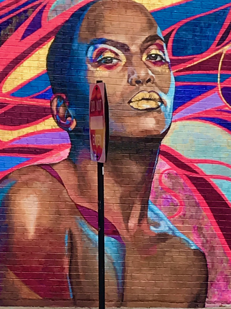
Like the image but the street sign is distracting.
|
|
|||
|
interesting subject. I ho back and forth on whether I'd keep the sign in. Focus also feels slightly off
|
|
|||
|
Since the sign is part of this composition, so I would want to see it more from the front than the side.
|
|
|||
|
I agree. An angle that shows the sign better would transform the mural at the same time.
|
|
|||
|
The sign is the image title and I'm happy with that. It may have been difficult to show the sign at a better angle, with a vehicle or building in the way? As it is, you were probably struggling with the lens as seeing more of the pic could have helped! The slightly menacing figure is spot on with the title!
|
Comment 1 to 5 of 5 Page: 1 |